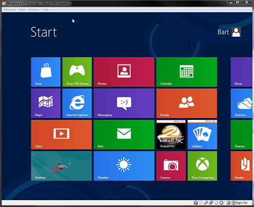
Long-term search engine bots crawling this blog may remember the post I made about the Windows 8 Developer Preview, back when it was released in October. In it, I questioned the usability of the Metro UI on non-touch devices. I’ll be brief: the Consumer Preview, released a few days ago, does not remove my doubts. On the contrary: it makes them stronger, because it is becoming apparent that this is really what the Windows 8 experience is going to be. At this stage, it is unlikely that Microsoft is going to make any of the invasive changes needed to fix the usability nightmare that is Windows 8 on a non-touch device.

Jensen Harris himself has acknowledged that Microsoft is aware the majority of Windows 8 installations will be on a non-touch device. So why do they force this tablet UI on us? Don’t get me wrong, when it comes to tablets Metro will work beautifully. I personally love the concept of apps with live-tiles, it looks great, and the accompanying Windows Store also feels like it could rival Apple’s App Store (if only it had more apps!). It’s a really really good user interface. For tablets!
The problem is choice
Or rather, the lack of it. I find it pretty baffling that Microsoft, aware as they are of Windows 8’s target market, is making the Metro UI mandatory for so many people who would be better off without it. Even more baffling is that they went out of their way to do it. The classic Windows 7 start menu is already there, all they had to do is not touch it.
Granted, there have been some improvements between the Developer Preview and the current Consumer Preview. For one, scrolling through the start menu now goes faster than a dead snail, which makes it actually usable with a mouse. I also like the solution of moving your mouse to the corners of the screen to bring up the start menu, charms menu, and apps task switcher. I don’t know how well this will hold up in a multi-monitor setup, but it’s a nice solution. Same goes for right-clicking in an app to bring up the app’s own menu.
The problem is that, nice as these solutions are, they are solutions to a problem that should not exist to begin with. All I want is an option, Microsoft. Just one checkbox will do. Please?
Context roulette
If you’re on a laptop or desktop PC, you’ll most likely be working with Windows 8 on the traditional desktop. I consider the desktop and Metro to be two distinct worlds, and one of my prime annoyances is how launching programs from the start menu means you’re constantly switching between the two.

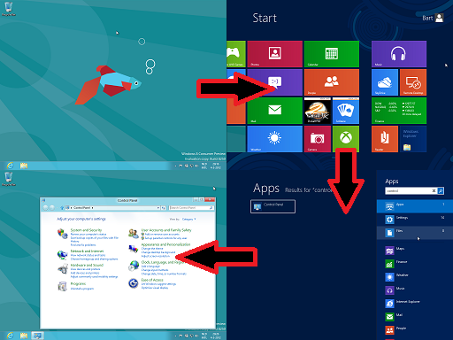
Even something a simple as launching the Control Panel becomes awkward with the power of Metro. First, you’re in the desktop and you press start. This takes you to Metro world. You then notice the Control Panel is not in the start menu (this is the untouched start menu as it came with the Consumer Preview). You then have two choices: you can either go to all programs and find it there (requires a right-click to call the context menu, then left-click “All apps”), or you can start typing the name and use the instant search to get it. Finally, you get thrown back to desktop world when Control Panel launches. Holy hell. Depending on whether you were using the mouse or the keyboard at the time, that’s a lot of fumbling to launch a simple program.
Another irritation comes from task switching. First, there’s no quick way of getting back to the desktop from Metro. You can either alt-tab (not very user-friendly, especially with a lot of open programs), mouse to one of the left corners of the screen and drag along the side to bring up the app task manager (Windows-tab also does this), or call the start menu and go from there. None of these options feels “fast and fluid”. Funny side note: when alt-tabbing, all of your desktop programs and Metro apps are represented separately, while in the app task manager the desktop as a whole just takes one spot.
I found the whole thing to be more disorienting than anything. When working with Metro I never felt like I knew where I was. Especially in the start menu. If I press Start again, will that take me back to the desktop? Or is there a Metro app which was my last accessed program? If I close this app, will I go back to start or to another app? What apps are even open? This is not the way people should feel when working with your OS.
Settings, schmettings
I’ll close by singling out another usability gripe that illustrates how I feel about Metro: the Metro settings app. How does one access it? It’s not in the start menu (at least not by default), and I couldn’t find it under All apps either. Typing in the instant search will give results from the settings app, but not by default so you need to click it or tab your way over there. It also never shows the settings app itself, just results from it. So how do you directly access the settings app?
Well, the fastest way I’ve found so far it clicking your profile picture in the start menu, and then “Chance account picture”. The only direct way of accessing the settings app I’ve found is by calling the charms menu, clicking “Settings”, and then “More PC settings” (ignoring the tempting but wrong button labeled “Settings” near the top). I have not yet found a way of pinning it to the start menu.
By the way, have you heard about Windows 7? It’s pretty awesome.