I’ve never written anything about Windows Phone before on my blog, despite the fact that I’ve owned a Windows phone for the last 3 years. Unfortunately, that phone was a HTC Touch2 running Windows Mobile 6.5, so perhaps it’s for the best that I have remained quiet because let’s face it: Windows Mobile 6.5 is a pretty crappy phone OS. So why did I put up with it for three years? Well, laziness, mostly… But enough about that, because all that’s in the past and now it’s Windows Phone 8 time!
Illuminating the darkness
Windows Phone 7 didn’t impress me enough to fork over a lot of money for a new phone, but with WP8 Microsoft seemed to iron out a lot of wrinkles that plagued its previous phone operating system. So, I finally decided to go for it and now I’ve owned a Nokia Lumia 920 for the past month. I chose the 920 because it’s the flagship WP8 device, it’s got a gorgeous screen, and it looks great.

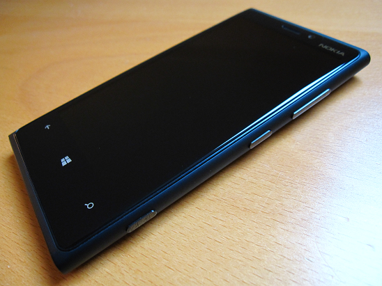
Look at this massive black monolith. I’m intimidated by it.
This post isn’t meant to be a formal review or anything like that; as the title suggests I’m simply describing my experiences with Windows Phone 8 and the 920 over the last month-or-so.
The device
The first thing you’ll undoubtedly notice about the 920 is its size. Then, as you pick it up, you’ll notice its weight. This is not a small phone. But hey, that 4.5-inch 768 x 1280 screen has got to go somewhere. And in this case, that ‘somewhere’ is beneath a slab of Gorilla Glass and and inside a polycarbonate unibody. Yes, the end result is heavy, and yes, it’s big. Not everyone may find it comfortable to use. Personally, it doesn’t bother me at all. It’s the largest mobile device I own and also the one I like the most, simply because of that beautiful beautiful screen.

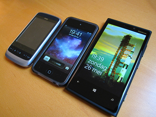
My HTC Touch2, iPod Touch 4, and Nokia Lumia 920
There’s also an upside to the 920’s weight: it actually feels like you’re holding a solid, durable, quality piece of engineering, that won’t just fall apart the first time you drop it. I prefer it much more than my plastic HTC Touch2, or my iPod for that matter. Its size also makes the screen surprisingly comfortable to type on, especially in landscape mode.
Windows Phone 8
I’d hate to use Microsoft’s own clichéd marketing terms of “fast and fluid”, but it is one of the quickest ways of explaining how the operating system feels to me. Unlike the hideous Windows Mobile 6.5, Windows Phone 8 truly is a joy to use. It’s fully built for touch, and does a fantastic job with it. Navigating menus and changing settings is a breeze. Apps load quickly, scrolling is smooth, and there are virtually no wait times for anything that doesn’t involve transferring data over the network.
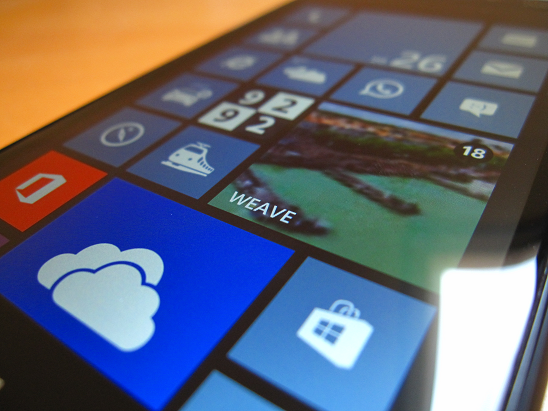
One of the best features of WP8 is the start screen. It’s fully customizable: every single tile can be moved around, resized, or deleted. There are no restrictions or fixed system tiles; sliding to the right from the start screen opens the main list where all of your apps (including non-removable system apps) are shown, and you are then free decide which of those you actually place on the start screen. There, live-tiles mean apps can display information directly on the start screen, without you even having to open them.

Of course, in order to enjoy all these apps, there have to actually be apps in the first place. It is often reported (in virtually all reviews covering Windows Phone that I’ve read) that Windows Phone’s app store (the Marketplace) doesn’t have enough quality apps to make the platform attractive to use. And there is certainly truth in this. Browsing the list of available apps feels a bit like going through the bargain bin in some cheap dollar store. There’s limited choice, and the quality isn’t great. Even some of Microsoft’s own apps feel they were rushed out as an afterthought.
But it isn’t all terrible. On the contrary: I have pretty much all the apps that I could want from a phone. I’ve got apps for the weather, public transportation, news, RSS feeds, Microsoft Office, SkyDrive, clocks, timers, calculators, etc… Not to mention Nokia’s quality HERE apps which offer free offline navigation and maps. Browsing the internet is great, reading and sending email is great, the calendar app is great. And yes, you can even call people with this thing and that’s great too. It’s true that there aren’t really any high-quality killer apps in the Marketplace that could help sell WP8 as a system, but that’s fine with me. This phone may practically be a computer, but it shouldn’t have to replace my laptop. I don’t expect it to do everything.
Whine time
Aside from the not-so-stellar app ecosystem I have only one real issue with WP8 and that is with the music app. The problem lies not with music playback itself, but with how song metadata is handled by the phone. For one, it only displays album art for about half my music collection, and I cannot figure out why. Secondly, for a few songs it displays incorrect album- or artist information, again for no discernible reason. There’s probably some compatibility issues with regards to ID3 tag support, but it’s really frustrating when every other media player (iTunes, VLC, my iPod, and even Windows Media Player and the Windows Phone management tool) says “A” while WP8 stubbornly says “B”. Hopefully this will get fixed in a future update.
The lack of a notification center is an obvious potential point of critique, but I can honestly say I don’t miss having one at all. I can’t even think of anything I would put there that isn’t already shown either on the start screen or on the lock screen. Any app can already notify you through its live tile, so why would we need a separate screen that just displays the same kind of information? Actually the best use I can think of for a notification center would be as a quick way of accessing some common phone settings, like those offered by Android’s notification screen. But that wouldn’t make it a notification screen. It would make it a quick settings screen.
Another minor complaint is the fact that aside from the start screen the phone isn’t very customizable, as there actually aren’t a whole lot of settings for you to tinker with. I’m not too bothered by this as there isn’t anything I would really like to change, but it might be an issue for some. There is also the hardware back button, where it isn’t always clear where it will take you. I’ve had it happen a few times where hitting back in the start screen took me to an app that I didn’t know was still open. Again this is not a major point or anything, but something that could maybe use an extra bit of polish in a future update. My last nitpick is with the volume controls. First of all pressing the hardware volume button opens up an overlay on the top of the screen that displays volume settings, and while you can adjust and turn on/off the phone’s sound you cannot toggle the vibration setting. The second annoyance is that there is no “quiet mode” or “night mode” where you can schedule times where you want the phone to be quiet, like between 22:00 and 08:00 on a work night or something like that.
Concluding remarks
Despite the fact that I’ve spent a large chunk of this post complaining, I’m actually very pleased with Windows Phone 8 and the Lumia 920. It does everything I want from a mobile device, and it does it really well. It’s a major step in the right direction for Microsoft, and definitely deserving of a larger market share than what it has right now. Whether it’s too late for that only time will tell.